
When Logos Go Quiet, IYKYK
- bengisuturk

- Feb 1
- 3 min read
Luxury logos once signaled true exclusivity: a visual shorthand understood by only a privileged few. But as logo-heavy branding flooded the market and fast followers rushed in with imitations, those symbols quickly lost their edge. The louder the badge became, the more diluted its meaning felt.
Quiet luxury emerged as a response to that fatigue. Not as a rejection of status, but as a smarter expression of it. Over the past five years, its codes have become familiar: restraint over excess, craftsmanship over visibility, substance over spectacle. The industry absorbed the lesson. The audience caught up.
Today, luxury is no longer negotiating whether to be quiet. It’s deciding how to be recognized. What we’re witnessing isn’t the rise of quiet luxury, but its evolution into a more coded, insider-driven language. Value is no longer announced; it’s identified. In the weight of a fabric. The precision of a cut. The placement of a detail only visible if you’re paying attention.
This is where silent logos enter the conversation.
Logos haven’t disappeared; they’ve been reduced, embedded, fragmented, and softened. No longer designed to be seen from across the room, but to be discovered up close. Recognition has become conditional. If you know, you know.
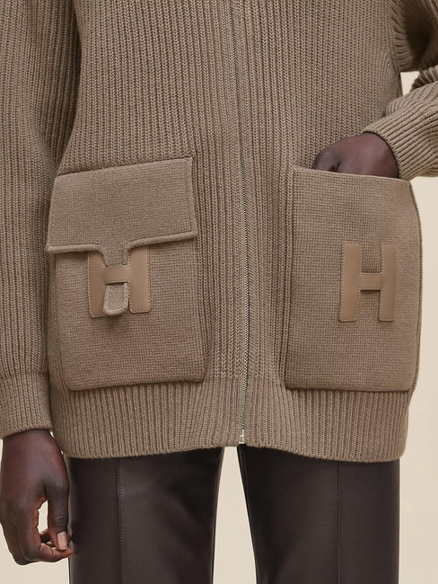
Hermès: The Logo as a Design Gesture
Hermès has long understood that true recognition doesn’t require repetition. Rather than placing its logo on the surface, the house embeds it into the design language itself. The “H” appears as a structural element: a buckle shape, a cut-out, a proportion. It functions less as branding and more as form.
Here, the logo isn’t something you notice immediately; it’s something you recognize once you already know what you’re looking at. The result is a silent signal, legible only to those fluent in the house’s codes.


Prada: The Triangle Without the Name
Prada’s triangle is one of the most powerful examples of logo reduction without loss of identity. Stripped of the brand name, the triangular plaque remains instantly recognizable through shape, material, and placement alone.
In recent collections, the triangle operates more as a geometric signature than a logo. It whispers rather than declares. The absence of the word “Prada” doesn’t weaken the symbol; it strengthens it. Recognition comes not from reading, but from familiarity.


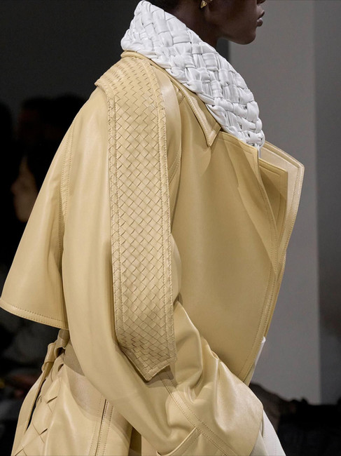
Bottega Veneta: Signature as Language
Long before the trend, Bottega Veneta built its identity around its intrecciato woven leather, a texture that is instantly recognizable but never logo dependent. Without a logo in sight, these interlaced pieces convey heritage and craftsmanship, letting texture replace branding as the signal of exclusivity.
In this sense, Bottega Veneta exemplifies the logic of the silent logo: a visual language that doesn’t announce ownership but confirms fluency. The intrecciato isn’t a trend, and it isn’t seasonal. It’s authorship. And for those who know, it says everything without saying anything at all.


Jacquemus: The Insider Wink
Jacquemus approaches silent branding with playfulness. A small “J” detail tucked into a shirt seam, a pant hanger, or a subtle hardware element becomes an insider wink rather than a statement.
These details aren’t meant to be seen instantly. They reward attention. You don’t notice them unless you’re already looking closely, and that’s precisely the point.

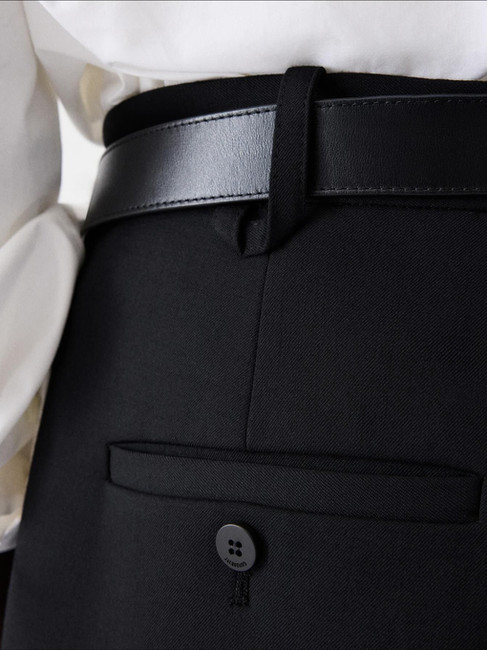
Dior: Shrinking the Name
In recent collections, Dior’s logo has visibly reduced in scale. Where once the name was meant to anchor a look, it now blends into it. Small, discreet placements allow tailoring, silhouette, and material to take the lead.
This isn’t about erasing identity, but about controlling volume. The quieter the logo becomes, the more confident the brand appears. Recognition replaces repetition.


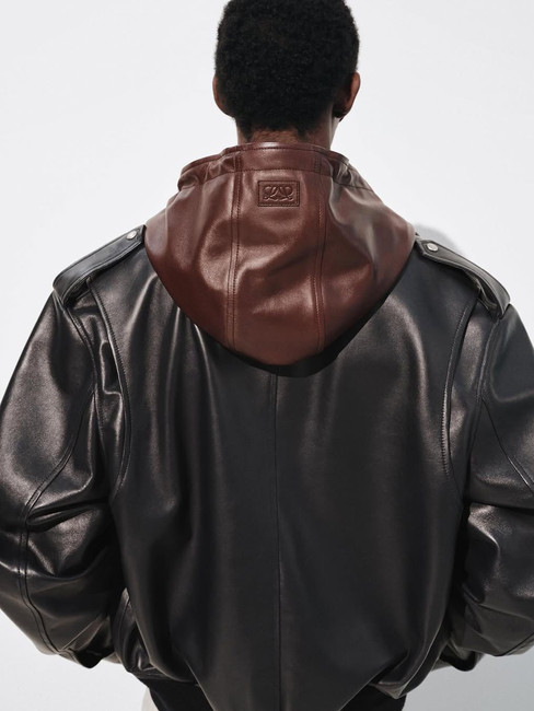
Loewe: Cutting the Logo
Loewe’s decision to fragment its logo (literally cutting it in half) marks a clear shift toward coded recognition. The brand no longer relies on a complete mark to be understood. Familiarity does the work.
For those who know, half is enough. For those who don’t, explanation isn’t required.


The New Logic of Luxury Recognition
Silent logos are not about hiding branding. They are about selective legibility. A way for brands to communicate with those who already understand, without over-explaining themselves to everyone else.
In a culture saturated with visibility, luxury has found power in restraint. Not by disappearing, but by choosing who it speaks to.
Because the most effective signal isn’t the loudest one. It’s the one that only a few can hear.


Comments